Research and testing helped Destionation2 to simplify their PDP and increase conversions.
Destination2 are a travel operator who provide some of the best deals on luxury holidays to Dubai, the Maldives, Thailand, Mauritius, the Caribbean, Europe and many more exciting places.
They specialise in providing exceptional holidays at affordable prices. Making your holiday dreams into a reality. They have dedicated travel specialists who are passionate about discovering new and exciting destinations and are only too happy to share their expertise, knowledge and personal experiences.
Additionally, their standing in the travel industry means they can secure some of the best deals and most affordable luxury getaways available.
They compare rates of major airlines, hotels and resorts to bring you the best prices on tailor-made escapes.
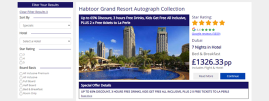
The nature of the website meant that many users would begin by entering a hotel search query. When selecting a hotel, users would typically have been shown a list of all available rooms, shown in price order (from low to high).
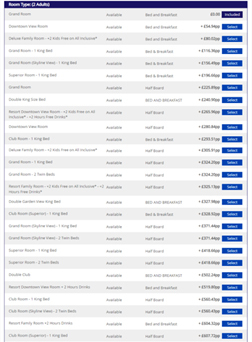
This list was typically long and quite difficult to read, and thus made it hard for the user to compare prices.
Destination2 are a travel company who compare hotel room rates from many different providers, to bring their customers the best deals, but the volume of choice shown in one long list was a little overwhelming for the user and not allowing this KSP to shine through.
As seen on the image below, the Habtoor Resort would have shown a list of rooms and the different prices for them.
By default, only some rooms would show, and users would then have to scroll to see the other available rooms and prices. This was causing a high drop off rate as it was difficult to navigate, and users couldn’t find what they were looking for.
To provide a more intuitive and user-friendly experience, a test was conducted that grouped together all rooms by board basis, so the content was more digestible.
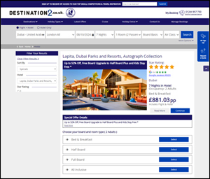
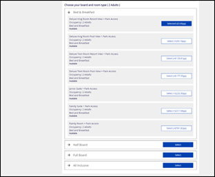
Rather than one long list (that often-showed 50+ rooms) which users had to scroll through, the test grouped the available rooms within the board basis ‘headers’ and just displayed the available board basis at first view.
Once the user selected which type of board basis they wanted, they would then see just the relevant rooms available within that group.
This limited what was shown to users in the initial view. And when users clicked to expand the relevant board basis the subsequent room type list was much more digestible and less overwhelming, as the images below show.
The results from this test were excellent. For users searching for hotels, there was a 46% increase in users reaching the summary page.
There was also a 23% increase in users reaching the Booking Form Page, demonstrating the ease of use of the new design to get users to the final step of their journey.
Destination2 also saw a 16% conversion rate increase (users completing a booking).
In terms of users looking to book packages, there was also an 11% increase in users reaching the Flight Page, and an 11% increase in users reaching the Summary Page. But also, a 12% increase in users reaching the Booking Form Page.
Destination2 were extremely happy with the results from this test and rolled it out to 100% of their traffic.
“Destination2 have had some excellent results from some small, but clever changes on their site. It has been great to be part of their experimentation programme as they have learnt more about their users and continued to improve and optimise their experience.”
James Harber
Customer Success Manager at Webtrends Optimize
Want to know more about how Webtrends Optimize can help you with A/B testing? Click below to send us a message or call us on 0333 444 5502.
Send message