The world of technology is an ever-changing landscape, and as one of the leading technologies in the industry, we have continued to make significant steps forward in the market since our separation from Webtrends Inc. in 2018.
Over the last 9 months, we have embarked on a project to redesign our UI. This new UI, known as wto7 has now gone live to all users of the platform, as of the 18th February.
I talked with our CEO Matt Smith and the delivery team, including fellow board members Matt Goodchild (IT Director) and Sandeep Shah (Product Director), plus Hannah Hamment (Designer), Kevin Satti (Lead Project Developer), James Harber (Director of Customer Success) and more, to understand why this project began, what this means for the future of Webtrends Optimize, and how our clients and partners will benefit from it.
Why was the decision made to deliver this new version of the Webtrends Optimize UI (wto7)?
Our existing UI was 6 years old before the changes came into place, as we delivered that immediately post-separation from Webtrends Inc., so it was due an overhaul. More and more enhancements and features have been added in that time, and the feedback was that it had become a little less intuitive for clients and partners to use, and a sticking point when coming to some renewals and sales.
As we are a SaaS (Software as a Service) company, we appreciated the importance of listening to our users and addressing this, to make the UI not only more user friendly, but actually enjoyable to use. It was a unanimous business decision that we should prioritise the redesign to ensure a more seamless and efficient experience.
What are the main benefits of wto7 - both internally and externally?
The main benefits are a faster and more intuitive UI. It will be easier to navigate for clients, easier to share tests with their colleagues, and importantly, easier to find features to help them on their testing journey.
This sort of technology is notoriously complex, but we have made it very simple to navigate and use. It’s also important for us to practice what we preach; we support businesses to make their websites more user-friendly and so re-establishing our own platform usability was key.
The new design shortens the time to value when new clients are onboarding, as the learning curve to understand and use the technology will be a lot shorter. Faster workflows will allow the customers to spend less time in the platform, meaning that they have time to create and manage more experiences to make positive changes to their site.
We have also focused on updating the accessibility of the product, so users with vision loss or colour vision deficiency will be able to use the product more easily. This will also help all users navigate and use the product, as it will be much clearer for all.
It will also be easier for our in-house team and our many valued partners. The code is a lot more straightforward, meaning development teams can better utilise their time elsewhere. Consulting teams will benefit from greater tools, including a new dashboard that brings important things to the forefront of the product. Streamlining this will improve the usability and experience for everyone involved.
Through an extensive beta programme that was open to all existing clients and partners, and was adopted by a sample group of 100-150 high volume users, we’ve continued to listen, and iterate. The feedback has been overwhelmingly positive.
“The changes have made my day-to-day job a lot easier. There are some really nice aspects in the redesign that just make sense. They look better, they work better. I still have access to all of the detailed reporting I need to make trusted, informed decisions, but I can now also share data and reports with the wider business and say, 'this is what's happened with the tests'.
“I always have a much clearer idea of everything that is happening with each experiment, just by glancing at the screen. I am very impressed the redesign as it makes things easier for the entire optimisation team.”
John Mills, Community Fibre
What are the specific changes that have been made?
It’s less about specific changes and more about the whole experience when using the product and improving the overall performance of it. The purpose wasn’t to add more features, but a positive outcome was clients and partners rediscovering existing features and now utilising these more.
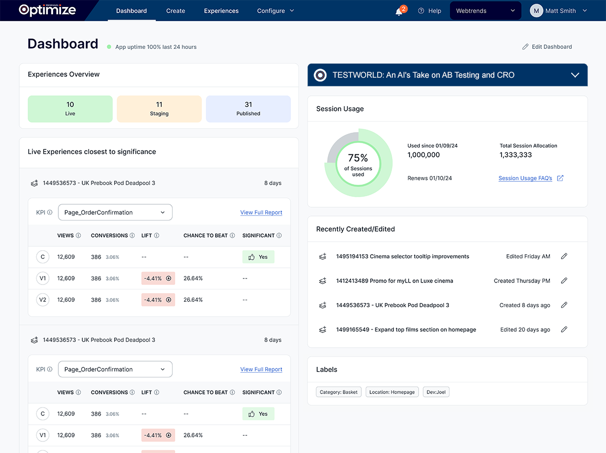
The new dashboard is a lot more intuitive and has a much more modern look and feel. The way it is now presented has removed things that people don’t need to see. The new dashboard will also allow users to understand at a glance if there is anything that needs their attention when entering the platform.
Users can expect to see an improved performance too, as now it is just one piece of technology. We have removed any unnecessary code and streamlined the whole platform, so it will be quicker (and gives time back to development teams to use elsewhere).
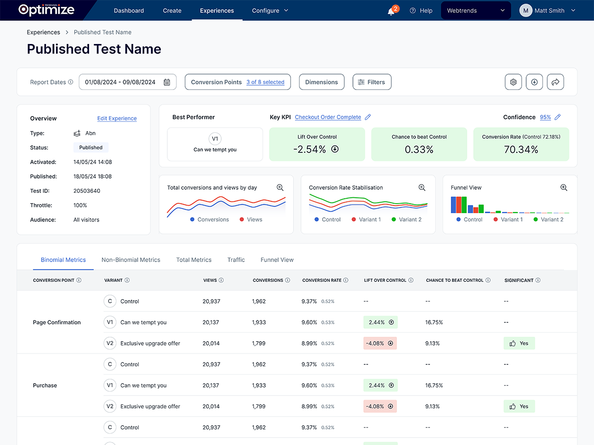
Reporting, which is a key area for our users, has been simplified and is a lot easier to understand. We have removed anything that users have told us they don’t need to see, and the overall presentation is a lot more coherent. The new design has taken away any hurdles of understanding the platform.
Jake Lambert, Head of Optimisation at Sussex based Customer Experience Digital Marketing agency, Fresh Egg, said “The changes have made everything so much clearer, and it makes so much more sense. It’s been a massive improvement and is really intuitive. Both my team and our clients can notice the difference in the ease of use, and how easy it is to interpret. All the feedback has been overwhelmingly positive.”
What have been the biggest challenges throughout this process?
The biggest challenge has been balancing priorities from a project management perspective. It’s been important to keep the bigger picture in mind. We wanted to make sure we kept serving our current clients and partners and ensuring they still get all the support they need, whilst committing to a big project that also required a lot of time and resources.
Our goal from the start was to keep the functionality of the existing platform so that users can still do all they do at the moment, whilst enhancing all areas wherever we can. There were also the usual technical challenges which you face with these projects. But solving them and fixing any bugs now is definitely better for everyone in the long run!
Despite some of the difficulties, this project has been the right thing to do for everyone. We have successfully stuck to our deadlines (and sometimes exceeded them!), put our clients at the forefront of everything we do, and have improved the experience of our product both internally and externally.
When we exit beta and launch to our whole client base, we will be able to judge even more the impact of the redesign, but already the changes are looking extremely positive.
What is the next delivery users can expect to see?
Now thar our the first phase of the redesign has gone live to all users, the next phase will be launching in April. Our team are working on even more changes and improvements until then. The main thing that users of the platform can expect to see is an improvement in the process of creating and editing tests.
We have been working on improving the WYSIWYG Visual Editor, which can be seen in the experiences section of the new UI. This new design will work as a plugin on the client’s own website, with a focus on logically grouping different functionality together, speeding up processes and workflows.
WYSIWYG means What You See Is What You Get and that is what we have tried to encompass. Users will be able to easily click, edit, drag, change things on their website, ensuring a more accessible platform for all. These changes will make testing significantly easier, making it more straightforward for clients with less development resources to collaborate with the rest of their team, and share projects that are being worked on.
Users can expect to see a streamlined and unified workflow, which will be much slicker than the existing one and more aligned with modern browsers, so all of our clients and partners can utilise our technology and wide range of features to their full extent.
Our updated Advanced Coding Editor will incorporate extra features that developers have told us they desire from their coding editors, such as dark mode, highlighting code, as well as pulling all of the coding areas of the platform into one place.
“The changes to the Webtrends Optimize UI have been excellent. It’s a really efficient way to work as everything is in one place. It has really helped the whole team to be able to collaborate and be on the same page with our CRO programme and we’re looking forward to the next phase too!”
Lisa Hogan, Sussex Cricket
How does wto7 now compare to our competitors?
Feedback received consistently from valued partners and experienced businesses in the CRO space told us that from a capabilities and features (and commercial model) perspective we were already comparable to anyone else in the market. The UI changes delivered in wto7 now address the one area in which users told us wanted to see improvement.
Our full capabilities and features are a lot more obvious, and clients can get results with our technology that they can’t get elsewhere. We have always been praised for our support and flexibility, this alongside our new intuitive, user-friendly UI, means customers get a whole package with Webtrends Optimize.
Based on the feedback we had received about the previous design, our main goal was to ensure our clients and partners enjoyed using the platform again. We feel we have created something that our clients and partners want and importantly, that they understand.
The initial feedback from the beta programme seems to confirm this, but we will continue to have bi-annual feedback loop sessions with users of the platform, so this high standard is maintained.
What does this mean for the future of Webtrends Optimize?
The redesign is an important step for Webtrends Optimize as it reaffirms our position as the best in class when it comes to the technology. When we were at the research stage, we identified that our competitors had easier to use UIs, now we can compete with this and prove to our clients and prospective customers that we have all the tools they need to improve website performance and optimisation.
We will continue to evolve and improve the user experience as time goes on. As we iterate, we want to ensure it conforms with the core principles and continues to be easy to use for our clients and partners.
As a SaaS vendor, we want to be available for everyone. We already have options that mean customers can license and scale accordingly. So, it is key to deliver a technology that meets the expectations at all levels. The new design is more appealing and easier to use, so already we are able to position this to existing clients and prospective clients.
Taking on an internal project of this magnitude sets the standard for future changes. We have redesigned our core offering and taken a risk in spreading our resources. But seeing the work everyone has done, the positive feedback from everyone that has seen it, and the already improved results for clients, proves it’s worth.
To learn more or see a demo of wto7, please get in touch.
