If you’re not sure what Amazon Assistant is, have a read of this article first: Amazon might be hurting your business more than you realise
Disclaimer: In this case, “hacking” refers to gaining an understanding of code that sat on our machines. For the purpose of this blog and investigation we didn’t gain access to protected environments – a little because we know we shouldn’t be doing that anyway, mainly because we wouldn’t even know how to.
We’ve spent a long time reverse-engineering Amazon Assistant – both to understand what it’s doing and how it’s doing it. The main reason is this – it gets in the way, hurts user experience, and might lead to you losing customers to Amazon. All things you would want to avoid, I’d imagine!

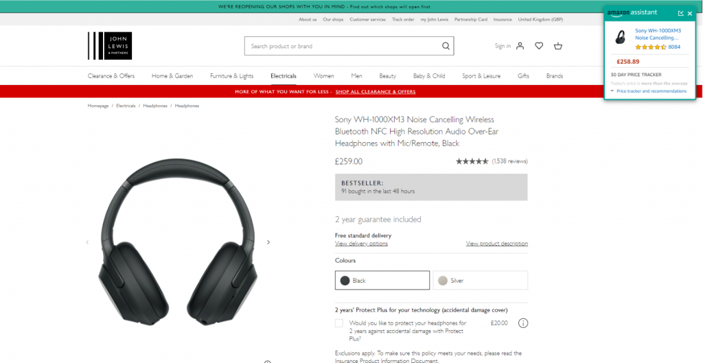
Amazon Assistant in action.
Over the years of keeping on top of what they’re upto, we’ve noticed several incarnations of this Amazon Assistant bar. It’s changed quite drastically since we first started looking into it – here’s how it used to look:

Anyway – brief history lesson over.
The most recent changes to the Amazon Assistant were huge, and showed a recognition of a few things that we’ll elaborate on herein.
New styling: Less volatile, still concerning
Amazon changed what was previously their bar-design, to a floating box – also both mentioned above. There are a few important things to note about this:
- It no longer breaks your sticky-headers – kinda. Because it’s not overlapping all of your sticky header bar or sticky nav, users will at least be able to see most of it.
- It is still covering the important bits – almost all retail sites have a similar experience. Mini-bag/counter in the top-right corner; ATB CTAs in the top-right corner; Next buttons in the top-right (or lower-right) corner. It’s the go-to place for things that get attention, and Amazon know this better than anyone. Why cover it? Why not have the panel in the lower-right corner? These are the questions we likely know the answer to…
It’s incredibly difficult to detect
It took us hours before having a working solution, and it’s only kind-of ok. Hours of reading source code, trying to break fundamental bits of a webpage including how elements are created to see how it responds, etc. Thankfully, we’ve done this so you don’t have to, which is our whole schtick.
Previously – Iframes
Previously, Amazon Assistant added an iframe directly to the page. Iframes are great because you have complete, uninterrupted control over what’s in the iframe – nobody can mess with the contents. This was, however, very straightforward to detect – it had an ID, a bit of which was static. There are simple methods you can use to check for elements matching that ID, and if found, you can track/modify as you please.
Now – Shadow DOM
Now, things are trickier. Web pages have had the ability to add elements into what’s known as the Shadow DOM (Document Object Model) for quite a while. The Document is all of your elements on the page, and the Shadow DOM represents things which were intended to be self-contained and not obviously visible/editable.
The Shadow DOM was originally accessible using JavaScript, so you had the ability to dip in and see what’s going on. A change in the spec, however, allowed developers to add a parameter of mode, set to "open" or "closed". As you’d expect from the description – open means you can continue to read the contents, and closed means you absolutely cannot. I’m sure W3C had their reasons for this, but made things awfully challenging.
Also now – Rotating IDs and element names, with nothing distinctive
As mentioned above, they used to have something easy to read in the ID for their iframe. Now, they both rotate their element names (between DIV and SPAN) and, and also have an elaborate way of generating the class-name on this element – a 36-character string of largely random numbers, that’s encrypted and then sliced to a random length.
It took a little too long to accept that we weren’t going to reverse-engineer that process (haven’t totally given up, chose to re-prioritise), to be honest, but we’re persistent.
Why so elaborate? When these sort of tools are operating on your website, questions like this are important to ask. This sort of elaborate procedure means wanting to make it very difficult for websites to even detect your presence (they hold almost no other value – it’s bad for performance, time to write the code, ability to remember what you’re doing, etc.).
So, why the changes?
We’d like to think it’s because we overdid the marketing on the previous Amazon posts, and someone working there noticed. It could happen!
Or, perhaps there was some instruction to the team that they needed to become detectable but still intrusive to journeys, and find the right layout of their assistant that would get as many people to buy with Amazon as possible.
Either way, it shows one thing – they’re taking their Amazon Assistant app seriously. Which probably means it’s working and means that retailers need to try harder to protect their websites.
You can still detect it though, right?
Yes.
For now.
It wasn’t easy, but we’ll keep on top if it. Thankfully, the new strategy is a lot more robust than the old ones. Amazon, if you’re looking, it wasn’t anything we’ve mentioned in this post, we’re keeping it a secret.
If you are worried about how Amazon Assistant could be impacting your site and are looking for help getting around this, get in touch directly with me at sandeep.shah@webtrends-optimize.com.


