The Craziest Button Test Ever Made: An exercise in thinking out of the box.
Button tests are for Day 1 AB Testers, right? I mean, we’ve all looked at Blue vs. Red, Buy now vs. Add to bag, and now we’re ready for Personalisation.
Things aren’t always as they seem, and in our world things seem to stretch as far as you’re willing to push. This post seeks to poke at the most simple of tests, and see just how far we can push it in an amazing Multivariate Test (MVT). The Fractional Factorial found in Webtrends Optimize allows you to run a Test to a subset of experiments, whilst still getting results which will hold up under the light of statisticians. Keep this in mind as we cover the many things we’ll be testing.
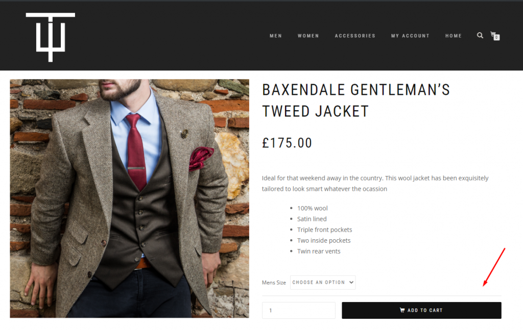
So, the button in question is our “ADD TO CART” button in the lower-right corner:
So, starting with the basics then:
Factor 1: Button Copy
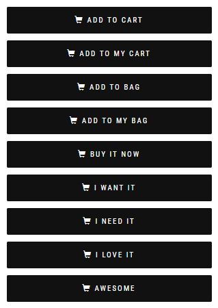
The words in the button can be split into two parts – a Verb (“Add”) and a Subject (“Cart”). Each of these can be tested for alternatives that resonate better with the audience of this website, especially as the term “Cart” is regional. Pushing this even further, we can actually have some fun with our Text. A project we ran tested the default button text “Add to Bag” against a few fun alternatives like “I Want It”, “I Need It”, “I Love It” and “Awesome”. Almost every variation we tried had a lift of over 50%, at Confirmation. This truly proved the importance of knowing your Users well.
So, a few simple variations of our button text looks like:
Factor 2, 3: Urgency
Next, we can think about baking some urgency into the button – both with additional static text, and also some styling effects. We can also be a bit more creative, by throwing in some rotating text with Social Proof messaging, like “500 purchased this week”, “what are you waiting for?”, “only takes a second”, etc.
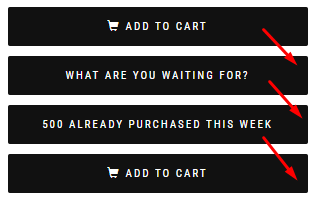
As for the styling, we’ll opt for a static red shadow, or pulsing shadow.

So, that’s currently a 9 x 3 x 3 MVT, which would equal 81 experiments as Full Factorial, and we’re just getting warmed up.
Factor 4: Button Colour:
Next time we think about testing button colours and yawn, we should remember Google’s famous 41 shades of blue test. On any high-traffic, monetised website, even a marginal lift can mean serious revenue. In this case, $200 million of it, just for realising that “a slightly purpler shade of blue was more conducive to clicking than a slightly greener shade of blue”. So… let’s at least try out a couple.
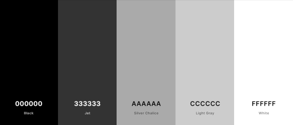
There are several theories on which colours are most appropriate. Firstly, and most obviously, one could consider Site colours:
Next, we could look at Bootstrap CSS. Created by the good folks at Twitter, this intends to create a homogenous layout and styling guide for the web as a whole, whilst promoting responsive and mobile-first design. Handily, it comes with a set of preferred button colours. The ones below are “Default”, “Primary” and “Success”.
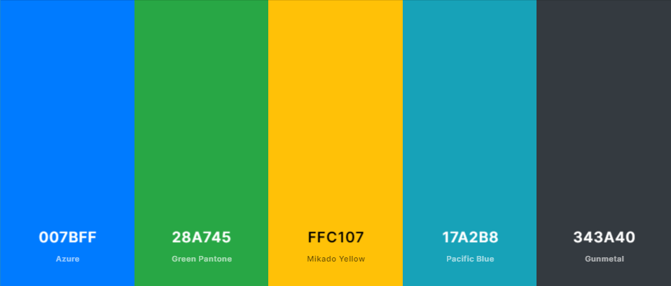
Beyond this, there are heaps of great resources out there, such as Adobe Color CC with an easy to use colour wheel, or Colormind which does a great job of demonstrating your colour scheme in action. For now though, we’ll keep tone down the crazy and pick just 2 alternatives: Bootstrap’s Primary and Success.
Test array: 9 x 3 x 3 x 3 = 243 variations of button.
Factor 5, 6: Apply the Google principle
Now that we have a range of colours to test on, we can consider shade. CSS makes it very easy to make anything lighter or darker, and even rotate the hue. We’re going to dip a toe in the water, and apply just a few variations, going 20% in both directions, for both lightness/darkness and hue.
So, with 2 more factors, each with 3 levels, we’re now up to 2,187 variations of our little button. Still feeling confident that our one control is the best option? Let’s press on.
Factor 7, 8: Iconography
Iconography on buttons can be seen wherever we look, and there are various strategies that should be considered.
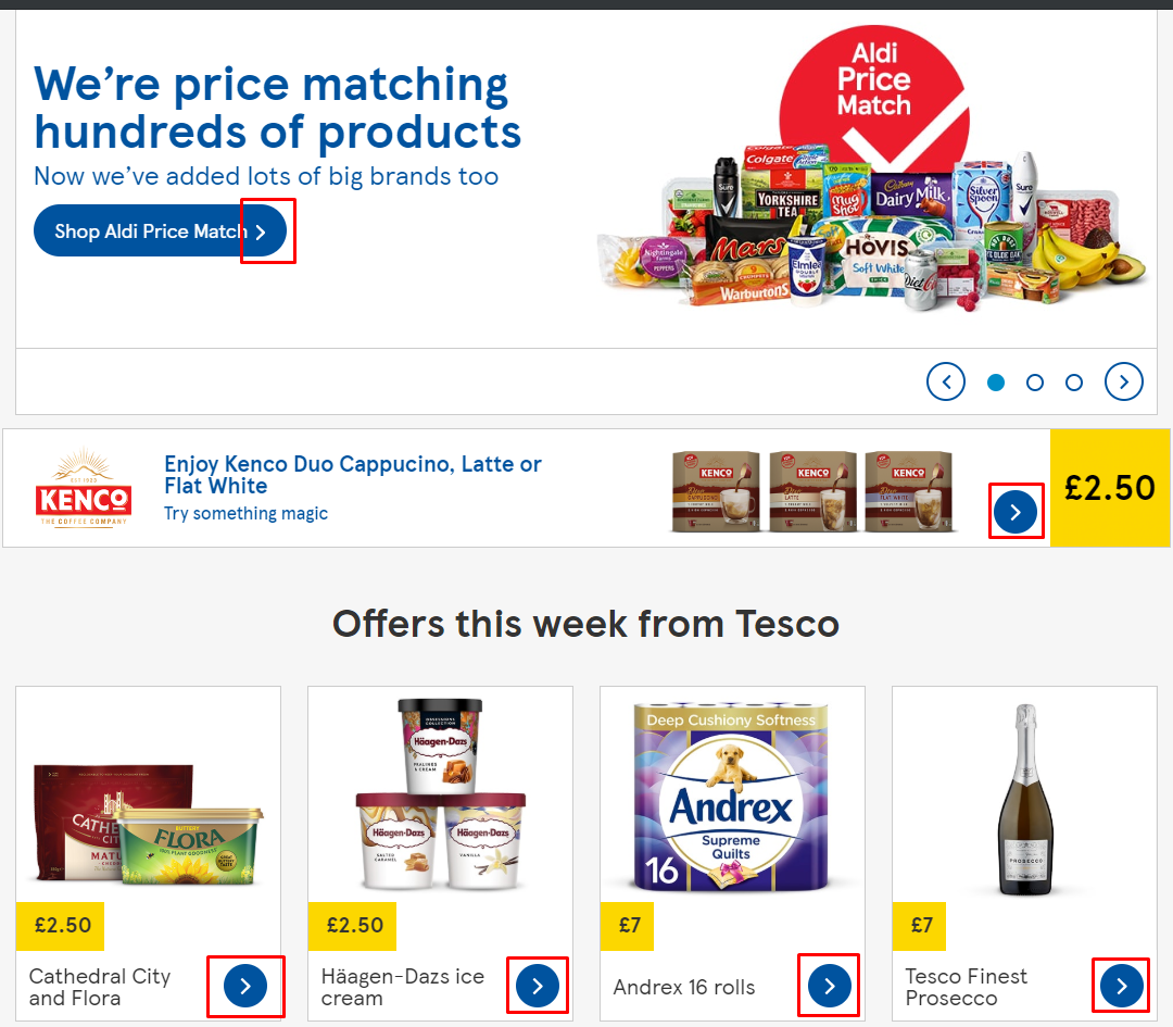
Tesco have opted for directional cues for CTA buttons suggesting advancement, as evident across their homepage:
Marks and Spencer, on the other hand, have a variety of relevant icons on buttons across their website:
![]()
So, whether we’re looking at directional, relevant, or security-driven iconography, there’s certainly something we can do here. In our case, we’ll test our cart icon against “nothing” and a padlock. We’ll also test the impact of directional cues at the end of our button, adding a single or double chevron.
So, that’s 2 more factors, each with 3 levels, and a total of 19,683 variations. And no, we’re not done yet.
Factor 9, 10: Font and Button Size:
These are amongst the most simple of things to test. We could again apply the Google principle and test every fraction of a Pixel or Em for each of these, but for the sake of simplicity and we’ll do a couple of variations of each – a slightly bigger and slightly smaller button, with slightly bigger text and slightly smaller text.
We may well find that the extra space in the button makes it easier to interact with, whilst the larger font is off-putting, or any other weird and wonderful outcome.
“But, could a slightly bigger button really make a difference?”
Yes. A while back, we ran an MVT test on a Payment page. Despite testing help text, neater layouts, improved loyalty messaging, button copy, adding additional buttons at the top of the page, etc., the only thing to make a positive impact was a slightly larger button. At over 2% lift at confirmation on a high-transacting website, the monthly incremental lift was well into 6-figures. All of that for a change that could have been built in 2 minutes using a WYSIWYG tool – why wouldn’t you want to try?
So, again – 2 more factors, 3 levels each, brings us up to 177,147 variations, and this is where we’ll complete our test for now.
We can happily end our test planning with a decent morning’s effort, and an astounding 177,147 variations.
A little bit of MVT Magic:
Fractional factorial tests make doing large MVTs much more traffic-efficient. The above test array of 9x3x3x3x3x3x3x3x3x3 as a fractional factorial test would be just 27 experiments. This means an incredibly less time to gain significant results.
Is that it? Have we thought of everything?
Absolutely not. We’ve discarded ideas along the way for the sake of efficiency, and this is just scraping the surface of what we can test. A strong consultancy team could easily turn this 100,000 variation test into a 10 million.
Nevertheless, the point of this isn’t for someone to go and build this button test (although we’d love to see it, if you do!). But keep in mind that there are always several angles from which you can consider even the most basic of tests.
As you look to expand upon hypotheses and build tests, don’t be afraid to think about how far you can push the test. Even if you don’t end up running all 177,147 combinations, don’t forget that it only takes one good change or combination to achieve a lift. It’s just our jobs to think outside the box and find it.

