In the dynamic world of digital media, mastering the art of subscription journeys is a challenge. It's a complex interplay between enticing users to engage while ensuring seamless conversions. After conducting over 200 AB tests with renowned media brands like the Wall Street Journal, NYMag, and Hearst Magazines, we've unlocked a treasure trove of insights and optimisation ideas that can transform your digital subscription journey. Welcome to your "Subscription Best Practice Playbook."
Navigating the Registration Wall
Registration Wall defined
A registration wall (or “regwall” for short) is a mechanism that requires users to register or login to a site to access specific content. This tool not only helps gather user data but also enhances reader engagement, often serving as an initial step towards encouraging subscriptions.
Registration optimisation tips
Allowing user freedom
The first step in the subscription journey often presents users with a registration wall. Our tests have revealed that being overly strict in preventing users from dismissing registration walls can be counterproductive. While the goal might be to increase registrations, it
can actually lead to lower subscriptions and higher bounce rates. Striking a balance between encouragement and user autonomy is crucial. We recommend allowing users the option to dismiss this initial regwall, which has resulted in an
average 8% uplift in overall subscriptions when implemented.
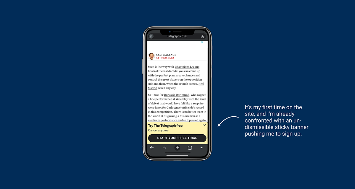
A case in point is the current Telegraph acquisition experience. Their team excels at getting Telegraph articles featured in Chrome’s suggested Discover articles. For instance, when I wanted a breakdown of the latest Champions League final, a perfect article appeared in my recommended feed. However, upon clicking it and arriving at the Telegraph site, I was immediately prompted to "START YOUR FREE TRIAL" via a banner that couldn’t be fully dismissed. This frustrating first impression prevented me from building a rapport with the Telegraph writers, and I quickly turned to another newspaper, resulting in a lost prospect.
Crafting Personalised Registration Wall Titles and Visuals
Now that the regwall is dismissible and less of a blocker for users, we want to make it more meaningful. Using a generic title can hinder conversion rates, as it lacks personalised incentives for users to register. Our experimentation catalogue shows that personalisation is key in digital subscriptions. When we display the title of the article the user was reading when they hit the regwall, interactions improve by 15%. Displaying the article image further heightens relevance and increases conversion rate in our experiments. Visual cues spark interest and retain attention, making users more likely to explore further.
Deconstructing Paywalls
Paywall defined
A paywall is a feature that restricts access to certain content unless the user has an active subscription. This system is designed to monetize content by requiring payment, thereby supporting the platform's revenue model, and providing premium content to subscribers.
Paywalls optimisation tips
Focusing user attention
When users reach their limit of free articles, they trigger the paywall. Unlike the registration wall, this stage should not be easy to dismiss. Users must decide between waiting for their free article quota to refresh or becoming a paid subscriber. Ensure they seriously consider this decision by preventing them from bypassing the paywall or dismissing it like a pop-up.
Elevating the Paywall Experience
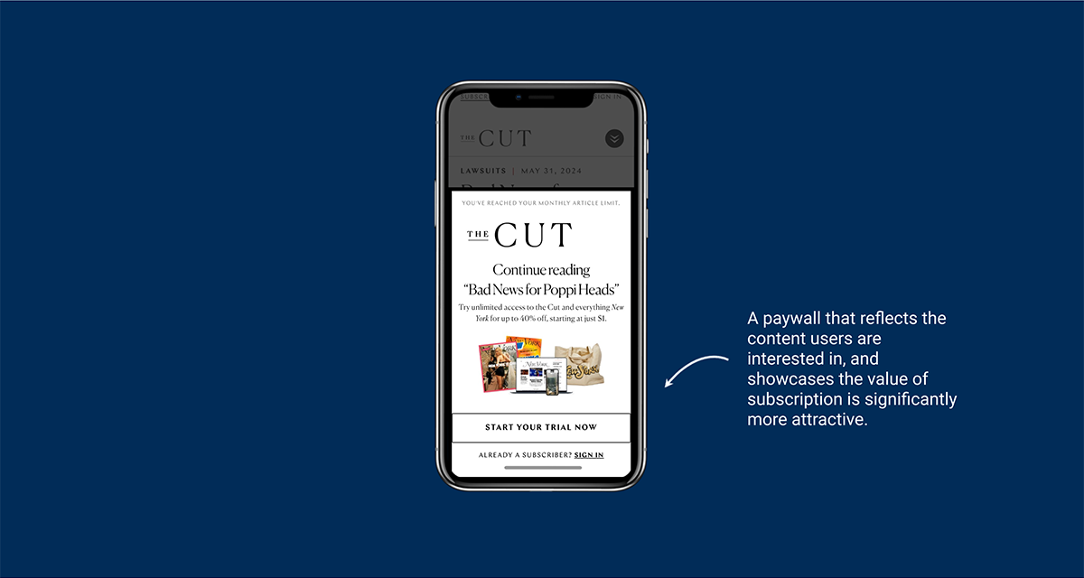
With a non-dismissible paywall, it's essential to make it highly relevant to the user. Use benefits-led unique selling points (USPs) rather than feature-led ones to persuade them to subscribe. Our experimentation catalogue shows that displaying the article title a user was reading significantly boosts their likelihood of interacting with the paywall and subscribing, improving subscription rates by 9%. Users appreciate this personal touch, which makes them feel recognised and valued. Additionally, visually previewing the subscription “pack” on the paywall helps users see the tangible benefits of subscribing, increasing conversion rates by 10%.
To further boost conversion rates, we recommend advancing paywall personalisation by including personalised USPs that align with a user's prior content engagement. Craft tailored subscription offers that match individual interests to amplify perceived value. For example, dynamic USPs that resonate with a user's unique tastes, such as a strong affinity for a specific subject or author, foster a deeper connection with the content. Our extensive AB testing shows that hyper-personalisation within the paywall can deliver impressive results, increasing subscription conversion rates by 13%.
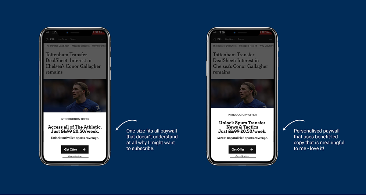
An example of a one-size-fits-all paywall missing the mark can be seen in The Athletic’s current subscription journey. Many digital subscriptions fail to leverage personalisation, but this recent experience stands out. As a Tottenham fan, I spend at least 75% of my time on their site reading the latest Spurs news. It feels impersonal and unengaging when I'm shown a generic paywall: “Access all of The Athletic. Just £1.99 £0.50/week.” This feature-led copy doesn’t connect with me at all. In the tribal world of sports, there's a massive opportunity to personalise paywall copy to be benefit-led and reflect the teams users are passionate about. Instead, we suggest changing the paywall title to “Unlock Spurs Transfer News and Tactics. Just £1.99 £0.50/week.” A small change, but one that recognises the reader and starts to build a relationship.
Streamlining the Checkout Process
The final stage of the journey is the checkout process. Ensuring a seamless and user-friendly experience here is crucial.
The Impact of Clear Cancellation Information
When it comes to the checkout process, ensuring that users can effortlessly scan and address their primary subscription concerns is paramount. By incorporating a simple yet effective strategy of placing a reassuring message like "you can cancel anytime" directly below the checkout next step CTA we've witnessed a remarkable 11% boost in subscription conversion rates. This subtle but powerful adjustment not only streamlines the user experience but also instils confidence, reducing the likelihood of subscription abandonment.
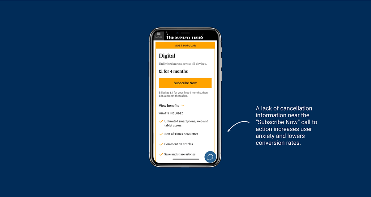
While most online subscriptions have adopted this small but powerful change, some still overlook it, unnecessarily increasing user anxiety. For example, The Times & The Sunday Times has an aesthetically pleasing subscription checkout screen and includes important T&Cs information beneath the "Subscribe Now" call to action. However, there's no mention of cancellation options unless users search the FAQ at the bottom of the page, which 90% of users are likely to miss. Testing the impact of including simplified cancellation information directly under the CTA is bound to result in a significant increase in conversion rates.
The Power of Image-Packed Checkout Summaries
The provision of an image-packed summary on the checkout page has been revealed as a game-changer, significantly impacting conversion rates. Extensive research has demonstrated that by offering clear product details and persuasive elements during the checkout process, we can effectively reduce user hesitation, bringing them closer to completing the subscription. On average, we've observed this practice leading to a remarkable 7% increase in subscription conversion rates. It's a simple yet potent tactic that enhances the user experience and bolsters subscription success.
Fostering Trust and Confidence
In the intricate landscape of digital subscriptions, every detail counts, and testimonials play a vital role. The absence of these endorsements on the checkout page can undermine user trust and credibility, potentially resulting in lower conversion rates. Peer recommendations, which are often underestimated, are a powerful tool on your path to subscription success. In our testing programmes, the inclusion of testimonials has increased conversion rates by an average of 9%. It's a testament to the influence of social proof in reassuring users and driving them to commit to the subscription journey.
Summing Up: Key Takeaways for Your Digital Subscription Success
In the rapidly evolving landscape of digital subscriptions, these insights and strategies serve as your playbook for enhancing the user experience, driving higher conversions, and fostering lasting relationships with your audience. Balancing engagement, personalisation, and user-friendliness is the key to subscription success, and these insights are your guide to achieving just that.